

Orderflow
Easily identify areas of high activity and visualize the tracks left by other traders
Charting
Choose from a selection of chart display options
Imbalance
Visualize imbalances using the advanced draw styles
Trade Ideas
Market generated information to help qualify trade ideas
Management
Another tool to help with trade management / exits
The Basics
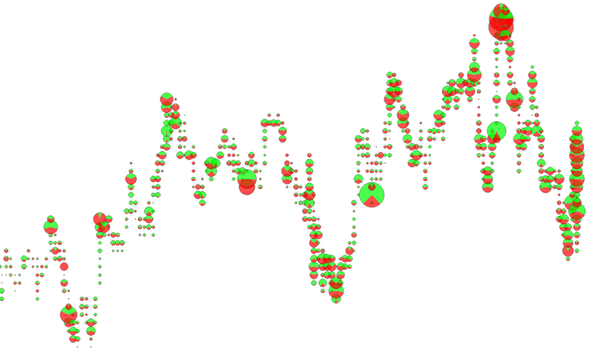
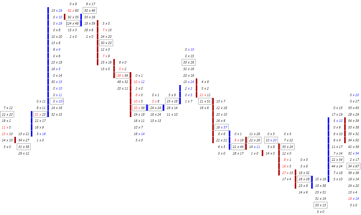
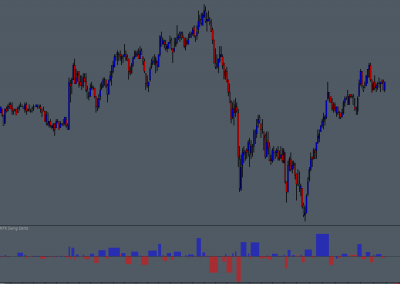
The Volume Dots study monitors volume at price data and provides a selection of different configuration and display options, including, Total Volume, Dominant Side Volume, Ask / Bid Split (segment), Ask / Bid Pie, and Ask / Bid Gradient Fill.
Volume distribution in each chart bar be visualized and quickly evaluated, including whether Ask or Bid aggressive (market) orders are dominant. The study can also provide graphical representations showing the balance between Ask and Bid orders.
Volume Dots and Volume Dots – LW studies are included in the TWFX Volume Dots study package (Volume Dots – LW is a lesser featured version of Volume Dots).
Volume distribution in each chart bar be visualized and quickly evaluated…


Possible Uses
The study is very flexible and can be configured to suit many different uses, for example it could be used in addition to (or in place) of the Number Bars study to highlight areas of high volume within each price bar, providing an immediate and obvious visual clue when an area that is of interest to larger traders is reached.
Areas of excess aggressive buying and selling can quickly and easily be indentified, which, in combination with other methods, may provide information that can be used to help qualify entry or exit conditions.
A specific example situation being, when price makes a new high through intraday resistance or above the prior day high, excess aggressive buying activity is identified and price immediately reverses. This can show that aggressive traders may potentially trapped in losing positions, and that there may be a large passive seller willing to absorb any aggressive traders. Both of these conditions being clues to a potential short term reversal.
Areas of excess aggressive buying and selling can quickly and easily be indentified…


Some More About the Study
In addition to the different display modes available, confguration options are provided to control volume filtering, volume dot size, volume dot color and color intensity.
The minimum volume filter threshold can be specified so that only areas of extreme activity are highlighted, alternatively, if a fuller picture of volume distribution is required, then the volume threshold can accordingly be set to a much lower value.
Volume dot size can be set to a fixed value, or, using a minimum and maximum size, the dot size can be calculated based on the volume as a percentage of the highest volume value in the chart, during the current trading session, or within the visible chart range.
Depending on the display mode being used, the volume dot color can be fixed or variable based on volume and dominant side. When using variable coloring and/or sizing, both the color(s) and size used are continually updated based on the highest volume, making it easy to identify and compare different areas of interest.
options are provided to control volume filtering, volume dot size, volume dot color and color intensity…
Combining with Other Studies
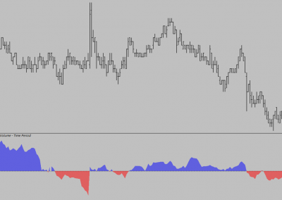
When used in conjunction with the Sierra Chart Market Depth Historical Graph study, the Volume Dots study can be a powerful tool for quickly identifying absorption into areas of expected liquidity, this combined with other methods and knowledge can be helpful in identifying potential reversal locations and trade entries (exits).
Whilst it is certainly possible to discern the exact same information from the Number Bars study, the visual approach used by the Volume Dots study can help with faster identification and decision making.
The charts below highlight an example of the situation described above, showing how the Volume Dots study makes identification of the absorption level quick and simple. As price approaches the high of day, into an area of potential liquidity, increased volume and excess aggressive buying (imbalance) is highlighted, however this is then immediately followed by an aggressive selling sequence, showing that not only are there now aggressive buyers potentially absorbed (by a passive seller) and trapped in losing positions, but also that aggressive sellers are now interested and dominating aggressive buyers.
the visual approach used by the Volume Dots study can help with faster identification and decision making…


What can I say, added it to my numbers bar chart and immediately, saw the benefit 🙂
As the delta or volume starts to increase, the bubble starts to build so imemdiately you can see where absorbtion/interest etc is taking place.
The ability to show both bid and ask delta as a pie/or as gradient/or as split relaly adds to the information (compared to just plotting the bubble with the dominant side – although this is available too)
As a long term user of Sierr Chart I know a good deal/a good deal when I see it (espcially if you are intereste din trading order flow).
Had a 15 day trial, after two days, purchased it outright.